Responsiveness
Components
Systems Design
Overview
This case study is about creating a cleaning up the existing and designing a new system for a complex and growing startup with its ever growing traffic on varied screen sizes. As Hive announced its new increasing capital and doubled valuation, its scaling needs had to be addressed with ever growing client relationships and increasing platform traffic.
Project Details
Business Goal
Consistent messaging matrix for greater client engagement on all device types
Success Matrix - KPI
Consistency and standardization of styleguide and component mapping
My Team & Role
Design Team, Dev Team, Marketing, QA
Scope
Website Audit, Edit and Evolve
Outcomes
Creating a unified design system with font mapping and adaptation of grid system for a smoother responsive experience
Key Pain Points
Design process was slow, painful, and unproductive
Inconsistent elements and unresponsive
Not agile
Key Goals
Saving a lot of time and reducing communication friction
Ensuring UI consistency (often associated with increasing brand trust)
Reducing complexity and ambiguity
Enabling and facilitating collaboration and consensus
Clean-Up and Standardizing Process
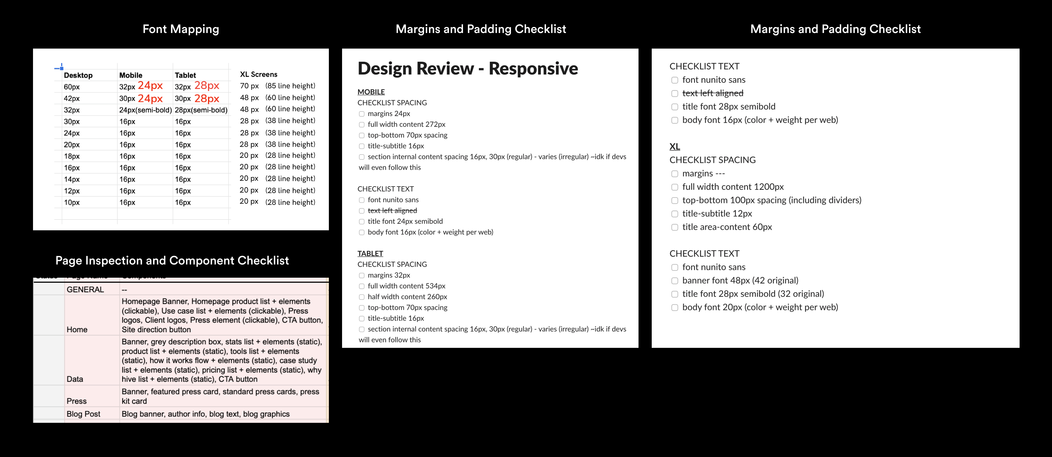
Inventory: With a vague strategy in mind, the design team decided to inventory every UI element in our application - creating a google sheet and recording screenshots of every page, every component and inconsistencies if anywhere
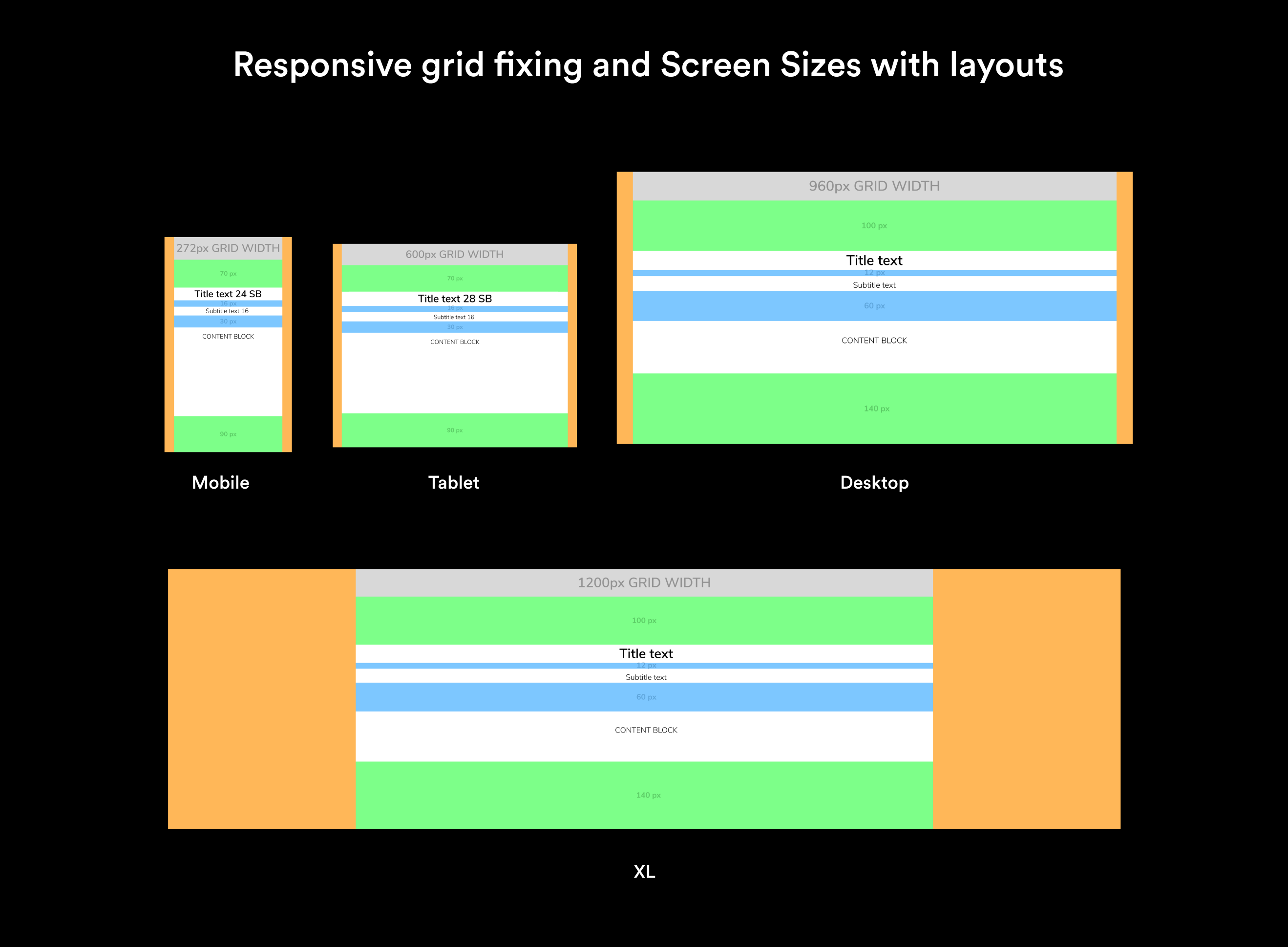
Inspect and recreate for responsiveness : Going forward, we inspected the website code recreated lost components and aligned on specifications of each component including font maps and fixing grids for all four different break points for screen sizes including mobile, tablet, desktop and XL (infinity) screens
This is some text inside of a div block.